Charles Bahne on the Scene of the Massacre
As we approach the anniversary of the Boston Massacre on 5 March, Charles Bahne, author of The Complete Guide to Boston’s Freedom Trail, kindly shared this essay analyzing what may be our earliest visual source on the question: What did the Boston Massacre look like?
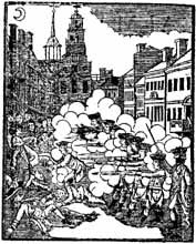
Besides the depositions and testimony given by eyewitnesses to the Boston Massacre, we have two contemporary pictorial depictions of the incident. Better known of the two is the copperplate print of “The Bloody Massacre”, “Engrav’d Printed & Sold by Paul Revere, Boston.” As discussed here, Revere’s print of the Massacre was copied—some say plagiarized—from an almost identical image by Henry Pelham.
The Revere/Pelham print is an accurate portrayal of the setting for the Massacre — the buildings, the starry night with its crescent moon, the overall streetscape. But its depiction of the events is far less accurate; issued as part of the radicals’ propaganda efforts, it contains some deliberate distortions. And to compress the entire action into one image, the perspective was foreshortened, placing the victims in much closer proximity than they really were.

We’re looking at a plan or map of the action that evening, drawn from an overhead perspective. North is at right, west at top. In the upper center the Town House (Old State House) is prominently marked. Rows of buildings line either side of King Street (State Street), with other streets branching off to right and left.
But while this plan is a more accurate portrayal of the Massacre events, it also has its limitations. Four bodies lie in the street, some drawn in intricate detail, along with six circles, which apparently show the injured townsfolk. That makes a total of ten victims, but eleven people were actually shot—five dead and six wounded.
At extreme upper right is a seventh circle, unlabeled by the artist and unnoticed by any earlier commentator. Could this be the eleventh victim, or is it something else entirely, being so remote from the rest of the action?
All four bodies, and five of the circles for the wounded, are labeled with letters. Two letters clearly match the names of the slain: A for Attucks and G for Gray. But the other two bodies are marked C and G, only a partial match with the other martyrs, Caldwell, Carr, and Maverick. The circles are labeled with three Ps and two Ms; the six wounded citizens were Payne, Patterson, Parker, Monk, Clark, and Green.
Some discrepancy may have been caused by the belated deaths of Patrick Carr and Samuel Maverick. Was one of them considered wounded, rather than killed, when the plan was drawn?
Still, there are just nine letters in this plan. With eleven known victims, we’re missing two Cs; while a G and an M appear to have been switched between the injured (Green) and the deceased (Maverick).

Unfortunately, the meaning of the letters, numbers, and circles must remain a matter of speculation. If a key to the plan was created, it’s been lost. Some say that a key was written on the back of the paper, which has since been glued to a board, permanently obscuring whatever it may once have said.
In their recent books about the Massacre, Neil York and Richard Archer both attempt to match the bodies and circles with the names of the fallen citizens—and they disagree. (Neil York consulted with me on this, and cites me in his book.)
The bottom line is that we know with some certainty where Crispus Attucks and Samuel Gray fell, next to the soldiers, and where Edward Payne was hit, standing on his doorstep at lower left. James Caldwell is one of the other bodies shown on the plan, probably the prominent one in the middle of the intersection. As for the other victims, we can only guess who fell where.
TOMORROW: How the scene looks today.

 In December 1774, Boston selectmen learned that children in three British officers’ families were recovering from the